
Wednesday, 11 December 2013


Monday, 2 December 2013

Friday, 29 November 2013


Friday, 1 November 2013
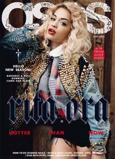
Front Cover Main Image Options

The photo's I have ticked I will consider using because they have direct mode of address, good lighting and relevance to my genre.
Wednesday, 30 October 2013

Friday, 25 October 2013
Genre's
Genre: a way of categorizing a particular media text according to its content and style.
E.g. magazine genre's: music, fashion, sport, home.


Sub-genre: A subcategory within a genre
E.g. some sub genres of music magazines may be: pop magazines, rock magazines, indie magazines.


Hybrid genre: A cross-genre is a genre in blends themes and elements from two or more different genres.
E.g. A music magazine could be a fashion magazine also this would be a hybrid genre as it is a mix of two genre's.
Music Magazine Proposal
My
magazine is going to be called ‘generation’ and is going to be a pop magazine,
its target audience is going to be girls aged 14+. It will include things that
girls around that age would like such as popular television shows, shopping, festivals,
popular music artists, fashion and makeup. It will be slightly more mature than the typical pop magazine e.g. top of the pops; it will be similar to magazines like
billboard and teen vogue. I chose pop as it is the most
popular type of music so will appeal to a wide audience and possibly secondary
audiences.
I would
publish my magazine with ‘Hearst’ who publish magazines such as Elle, Company, Bazaar and Cosmopolitan so they publish magazines relating to fashion and with
similar target audiences. They also publish magazines such as reveal and inside
soap relating to the gossip side of the magazine and they also publish sugar
scape; for the younger audience.
My
magazine will be distributed in print form but also a replicated website where
readers can interact by a daily updated web page, and can access things spoke
about in the magazine such as music videos and new artists.
Some
features I will be likely to include in my magazine are: festivals and fashion
event coverage, high street versions of celebrity outfits, how to recreate
celeb makeup looks, makeup reviews, artist interviews and weekly music charts
and up coming artists. My magazine will be £2.50 as in my target research that was
the most popular price for a magazine.
My
unique selling point will be that it will be a music magazine but it will include all the aspects of the music e.g. the fashion and the makeup of the actual artists etc.. This will hopefully appeal more to my target audience of teenage girls. Also that it will be slightly more mature than the typical pop magazine so hopefully appeal to a wider audience.
Thursday, 24 October 2013
Audience Research
.PNG)
.PNG)
.PNG)
.PNG)
The results which I got from my survey will help me decide what to include in my magazine, for example: my magazine is going to be around £2 and £2.50 as that is the amount the majority said they would most pay for a magazine.
Wednesday, 16 October 2013


Summer Photo's


.PNG)


I will use these pictures for my festivals and concert aspect of my magazine. They are useful because they have different types of artists in them and portray the audiences experiences as they are taken from the crowd. This interacts the audience as they might have been there or it would make them wany to go.
Wednesday, 9 October 2013
Contents Page

The
colour shceme of my contents page is red, white and blue this matches my front
cover and creates brand identity. I have used various image's to promote what the articles are going to be about and anchored them with a brief description. To improve my contents page I would have made the text bigger and bolder so readers know where to find the articles.
Aquinas Magazine

Aquinas Magazine Evaluation
I have used a colour scheme of red white blue and black. I
have done this because the red and white stands out against the white
background and would grab the reader’s attention. Also the A on the Aquinas
logo is red so could be considered the brand colour. My main image is of an
Aquinas student and it anchors the pull quote. As the pull quote is positive I
have chosen a happy photo for my main image.
All the articles I have featured all relate to my target
audience research; what they filled out on the questionnaire. Hopefully this
shall appeal to the target audience as it includes things they have told me
they like.
What I think is good about the cover is the range of
photographs. They show what was included in the magazine.
What I would improve is the text; it is very
plain and boring. Another thing I would change is the layout; I would make it neater
so it’s easier to read and more appealing to the eye. I would also give more
details and better over view of the main article
Friday, 4 October 2013
Contents Page Analysis

The main image on vibe magazine’s contents page is of famous
musician Kanye West. This relates to the cover as he also the main image on the
cover and his article is being used as the main selling point. The image is in
black and white, this brings more attention to the only thing in colour on the
page which is the heart. Hearts connote love suggesting the article could involve
personal things about Kanye West; this would be a unique selling point as Kanye
West is not typically known for speaking about personal issues. The heart is
being held by a woman’s arm, this also suggests the article could be about personal
things as the woman backs up the connotation of love. However as you cannot see
the woman this creates mystery and doesn’t take the main attention focus off
Kanye. Kanye is also dressed very smart enhancing that the magazine also has
aspects of fashion and not just music. This gives the magazine another selling point.
The background is grey and very neutral this makes sure it doesn’t
take any attention away from the main image. However a large ‘V’ in the background
represents the brand identity and reminds you of the magazine name but it again
it is half covered to not take the focus point of the main image.
The word ‘contents’ is in black and sticks out
from the background. It is laid out in an unconventional way; this might anchor
the edginess of the magazine. In contrast the sub headings are in quite a
classic, fancy writing this portrays all the different levels of the magazine
and might anchor the sophisticated dress sense of the artist in the main image.
The house style is very neat and spacious, there is no irrelevant information
and it looks very professional matching the colour scheme and main image.
Wednesday, 2 October 2013


Sunday, 29 September 2013
Double Page Spread Analysis
.png)
The
overal colour scheme is white, grey, black and red. The colours make the page
look quite classic and sophisticated perhaps connoting the musician the article
is about. The colours also go together and it makes the page look neat. The background
being grey and white also makes the main image stand about and be the center of
attention as it is the only thing with colour. The colour scheme is also
consistent throughout the front cover and the contents page giving the magazine
its brand identity.
The
main image is of ‘Florence’ sitting on what seems to be an American flag. This
is relevant as the article is about her dominating the states and her sitting
on the flag gives us the impression she is in control. Also text reads that she
has America ‘at her feet’ therefore the image is taking a saying and making it
literal. This is then enforced by her facial expressions and posture; she looks
in control. The photo has been taken from a long shot so we can clearly see
what she is wearing and it contrasts with the background. She is also looking
straight at the camera suggested the article might be somewhat personal, this would appeal even more to fans of Florence Welch.
The
spread is very uncluttered and like the color scheme makes the page look neat
and classy. The main image has been positioned on the left and fills the whole
screen; this lets the reader know straight away who the article is about.
The first bit of text you read is a large ‘USA’ spread onto
both pages. It is so big it looks part of the background making the main image still the main focus of attention. The fact it is grey
and blends in makes the main title stand out more but the size of it suggests how
important the ‘USA’ is to the artist. The second masthead is a quote from a Florence
and the machine song. This will attract her fans to read the article even more.
The text introducing the magazine is a rhetorical question and very vague perhaps
intriguing the readers to read on to find out the answer.
Thursday, 26 September 2013
Magazine Cover Analysis

We love pop is
a pop magazine. Its primary target audience is teenage girls around 11-14 year
olds.
The masthead
is very bold and bright and is the first thing that catches your eye. It is in
a speech bubble; this connotes text messaging and gossiping. This would help
target the magazines primary audience of teenage girls as these are two things stereotypically
associated with them. The ‘love’ in the heading is also a picture of a pink
heart. This also connotes the internet
and teenage colloquial language another thing which is heavily associated with
the teenage generation in general. The black on the white stands and it is
outlines by pink which has girly connotations.
The
strapline reads ‘Hot! Hot! Hot!’ this is informal language something that is
again stereotypically used by the younger generation. It is very bold and the
explanation marks make it stand out as something that needs to be read. The colours
used are pink, white and yellow; these are all very happy, bright colours. This
reflects the light-heartedness of the magazine. The yellow could also represent
summer as the magazine was released in august. The three colours all stand out
from each other attracting attention like the explanation marks. There are
three pull quotes on this cover. They are all things that are vague making the
reader want to find out what context they are in and perhaps what the stories
behind them are. They are also light-hearted again reflecting the theme of the
magazine.
This magazine
has a plug advertising X Factor bingo, using the X factor will appeal the target
audience. There are two straplines; one at the bottom one at the top. The one
at the bottom is labelled ‘new term spesh’. It is yellow which is
stereotypically a positive colour, this is suggests they are trying to put a positive
spin on something the reader stereotypically sees as bad; returning to school. This
would appeal to the target audience as the magazine is suggesting it can make a
bad thing better.
All the
colours used on the magazine are very bright and eye catching. The pink
contrasts the yellow making it stand out. This would help attract the target
audience as it would stand out on the shelf next to competitors. Pink, yellow and purple all have connotations
of being very girly and happy which are things which are associated stereotypically
with young teenage girls.
There are
three main images on the magazine. This might help give the magazine a wider
target audience as it creates a larger chance that someone will see their
favourite artist on the cover. And seeing their favourite artist would encourage
them to buy the magazine. The images are also anchored by pull quotes suggesting
what they will be discussing inside the magazine. Some other images include
pictures of popular artist anchored by story headlines e.g. the rhetorical question
‘going blonde harry?’ this would intrigue readers to find out the answer. In the
bottom right hand corner are pictures of ‘fashion to fall for’. Fashion and
clothes are something popular with teenage girls so this applies to the target
audience. Also since this is a music magazine, the clothes section being included
is a unique selling point.
The house
style is very busy and bright. Everything is overlapping all, all the text is
bold and the colour contrast helps it stand out. There are a lot of images
helping to portray all the types of stories going to be included in the magazine.
Wednesday, 18 September 2013
Evaluation Of Front Cover Photos

I ticked these three photos because they had the best lighting and fit into the grid from the rule of thirds the best.

From my audience research I discovered that 'sitcoms' are the most popular t.v. programme. Due to this I may add a review page of sitcoms in my magazine, to tell people of new sitcoms and if they are good or not.


If I was to do a section on film it would include coverage on comedys and horror's as they were the most popular.

Wednesday, 11 September 2013
Rule Of Thirds
The Rule of thirds is when a picture lines up with a grid which consists of 9 boxes and helps draw attention to certain parts of the image. E.g. in most pictures of people, the eyes are 1/3rd down the photo aligning with the first line on the grid.


The subject is on the right hand side of the photo, her eyes are lined up with the first line. It is an mid shot.

The subject is in the middle of the photo his eyes line up with the first line and his shoulders with the second. It is a medium close up.

.PNG)
Subscribe to:
Posts (Atom)